Hello!
I'm Jesse, a design leader with a strong business-oriented approach, specializing in the development of digital solutions. View my work below.

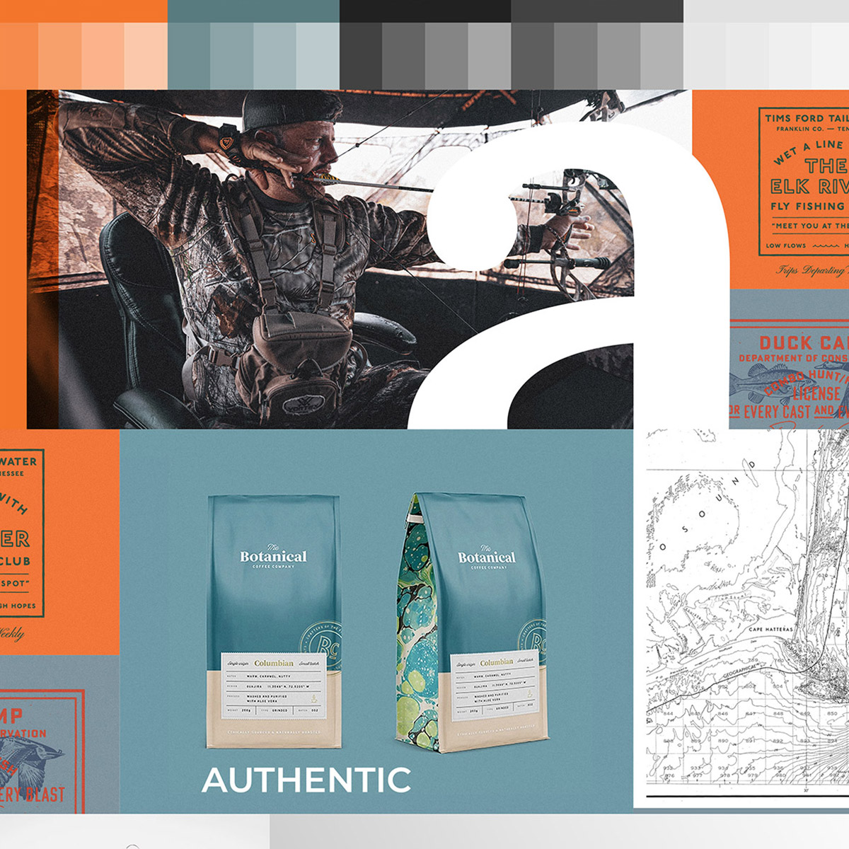

Buddy Outdoors was conceived with the objective of elevating the experience for hunters and anglers. Their mission involves the curation of premium products delivered on a quarterly basis. My role encompassed brand development, design, and marketing efforts, tailored to engage a diverse audiences.

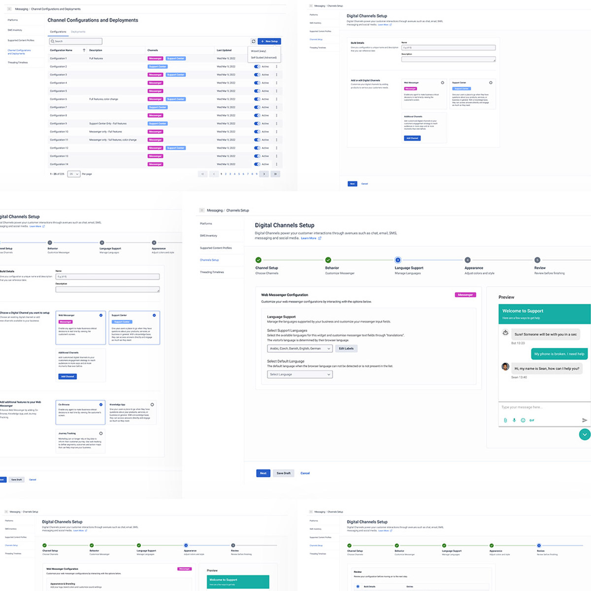

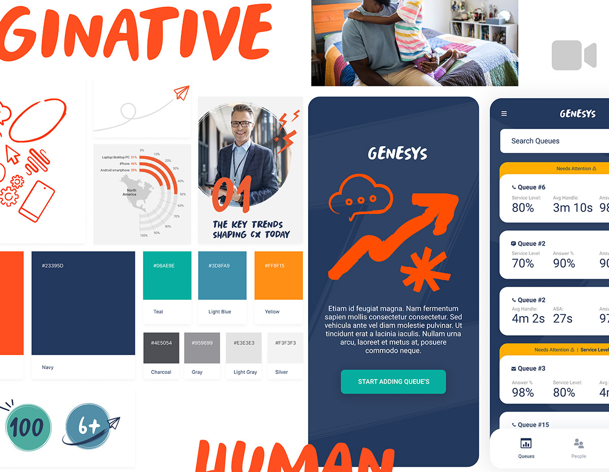
Within Genesys Cloud, various apps are tailored to meet the specific needs of customers. The administration tool served the purpose of enabling users to customize and deploy web messenger features on a website. The challenge was to design a wizard-like interface that seamlessly guided users through the editing and deployment process.
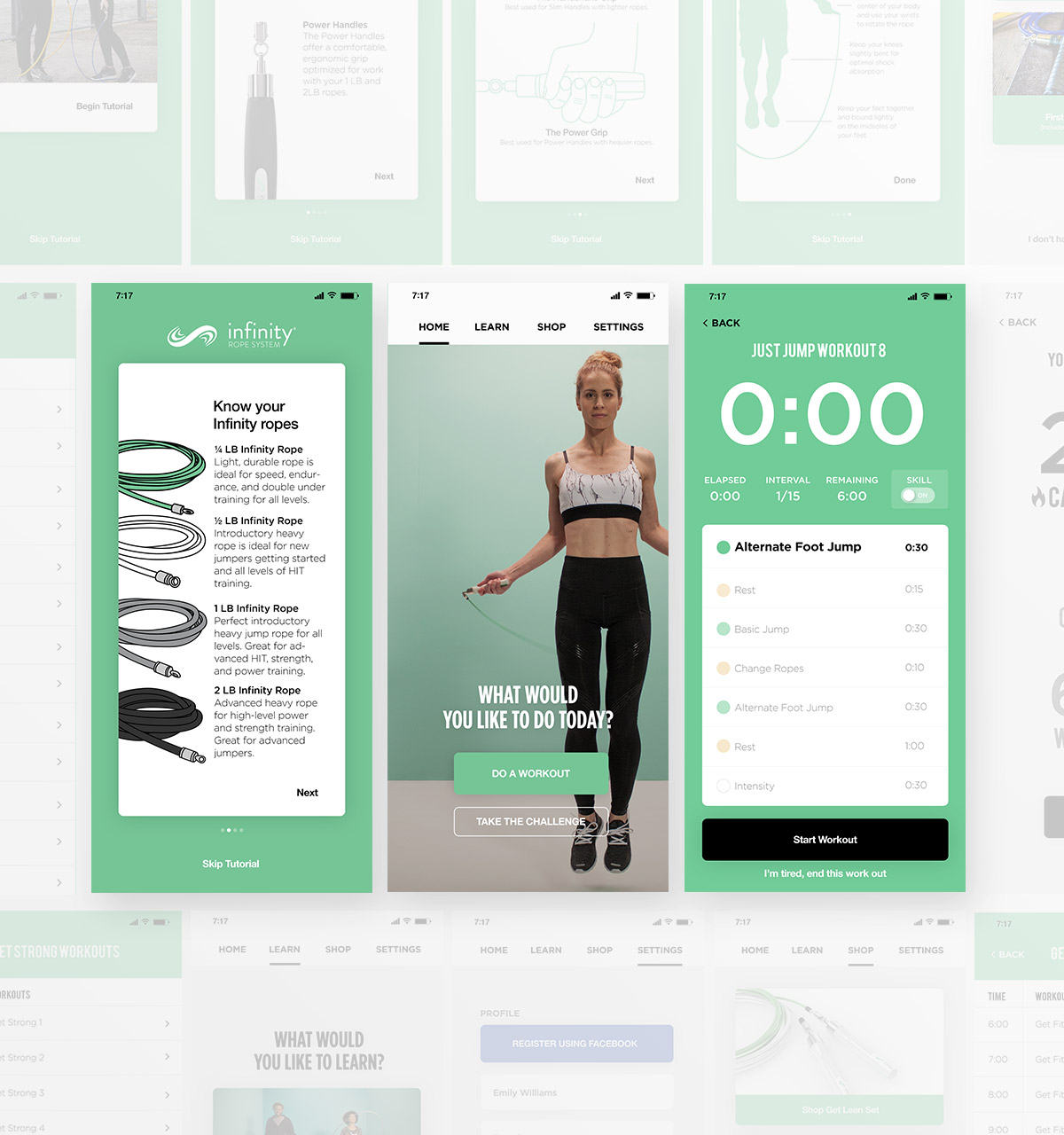

In the ever-evolving landscape of fitness technology, Crossrope stands tall as a testament to innovation and excellence. This premium weighted jump rope system is not just another workout tool; it’s a transformative fitness experience designed for life on the move. As a key player in its development, I had the unique opportunity to help craft the engine behind Crossrope’s mobile app, a platform that has since climbed to the coveted position of the #1 jump rope app on both iOS and Android.
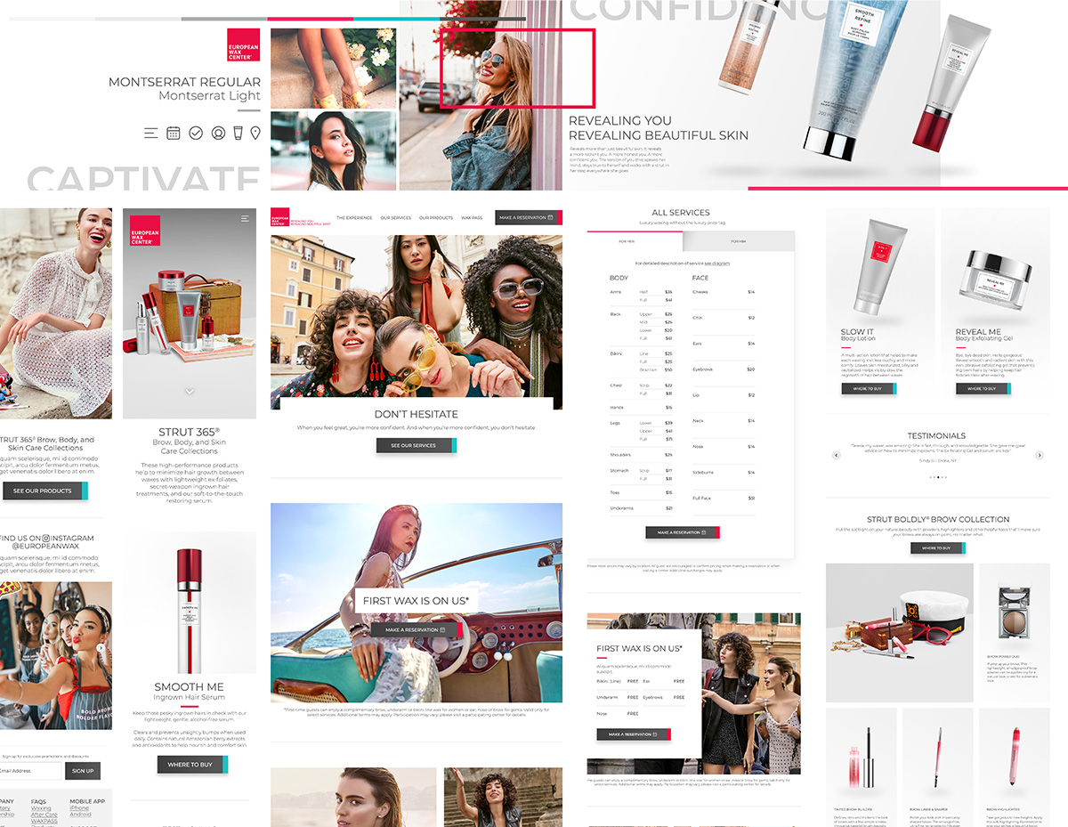

Not every project merits the CEO's attention, but this one stood out due to the exceptional brand it represents. Collaborating with David Coba to envision a fresh experience for their website, shop, booking system, and app was undeniably one of the most exciting projects to be a part of.
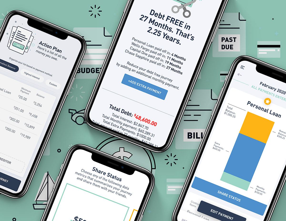

I've had the privilege of designing and building numerous apps, always aspiring to secure a spot on Apple's App Store feature list. Surprisingly, this modest calculator app achieved that milestone, earning the esteemed title of "App of the Day." I felt honored to be recognized for an app that empowers users to calculate their debt and embark on a journey toward financial freedom.

Managing a call center is a challenging task. This app was specifically crafted to oversee the performance of both the center and its employees. Managers can effortlessly monitor metrics such as data-based calls received, call duration, and more. Additionally, the app provides real-time alerts to managers in case of hang-ups, enabling them to make prompt adjustments as needed.
Uniting two companies into a single entity is no small feat, and the challenge intensifies when tasked with designing the company's website within a few weeks. Collaborating directly with the management team, I successfully navigated this endeavor, delivering a design that became instrumental in shaping their vision for the future of the unified company.
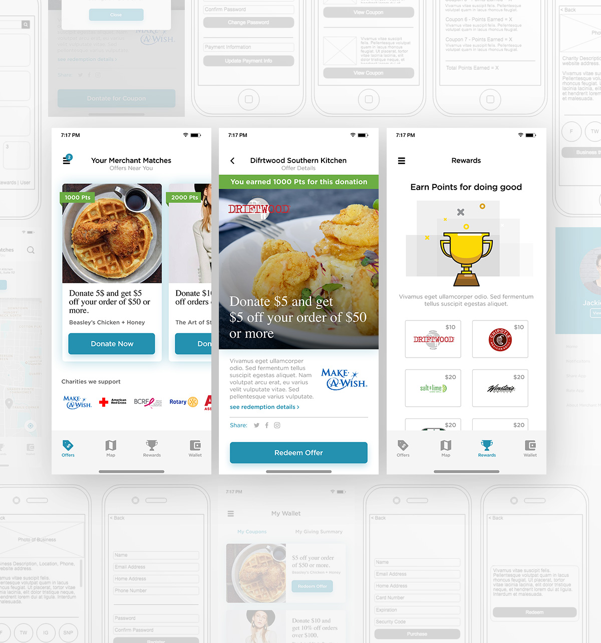
Doing good while doing business. There are these assumptions that most people are generous by nature. Though most people don't know how or where to give. Creating a simple way to give will doing business was the goal of the Merchant Match app. You are spending money anyway at a business, why not donate a portion of it to a charity. The app allows the user to search for business participating in the program to receive incentives by doing business with them. In turn, the business donates a portion of the money spent to a charity.
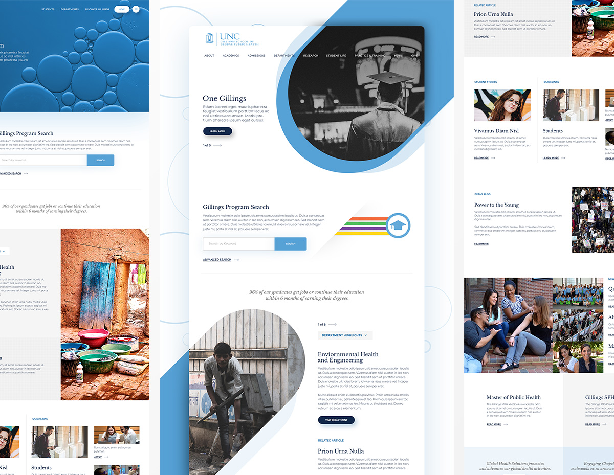

When your college is pitted against Ivy League schools your website has to compete. These are concepts for the UNC Gillings School of Global Public Health all created for the pitch to help the client envision what their new website would look like. The three concept varied from radical to structured all while keeping things really simple.
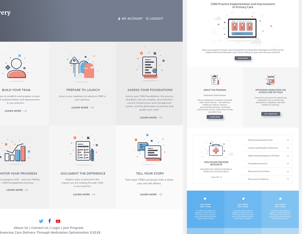
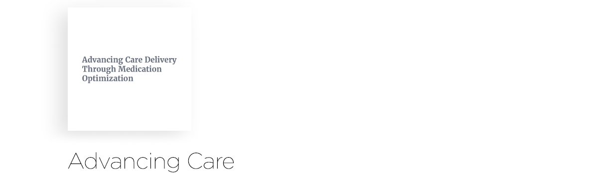
These concepts were created for a training platform. Pharmacist needed an easier way to train their colleagues to reduce primary care visits by educating their customers to better understand their medication. The clean look and feel coupled with an aesthetically pleasing iconography allowed the user to easily navigate through several training programs the platform offered.
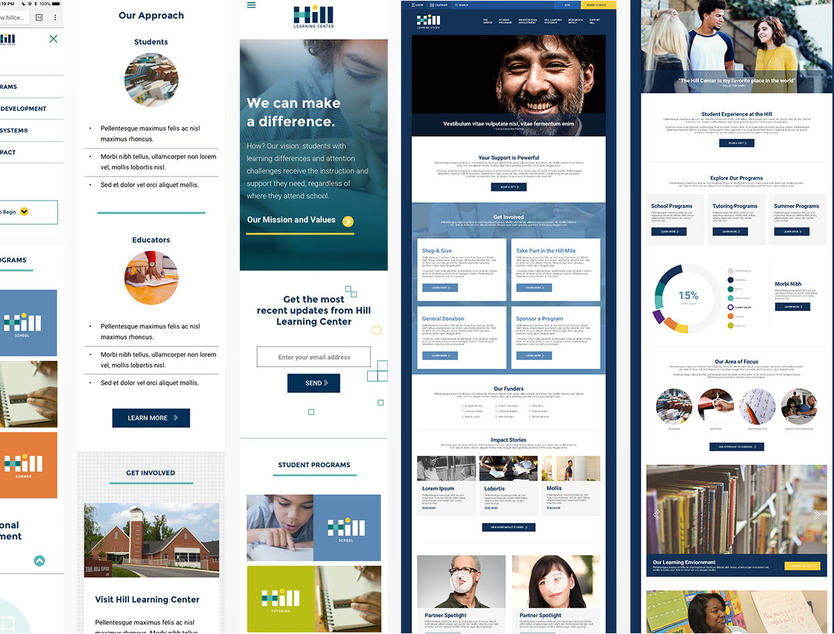

These concepts were created with mobile in mind. Designing in desktop version but also thinking about how things would react in a mobile environment. Simple grids, graphic elements and bold colors were used to help elevate the learning site to more than just informational.
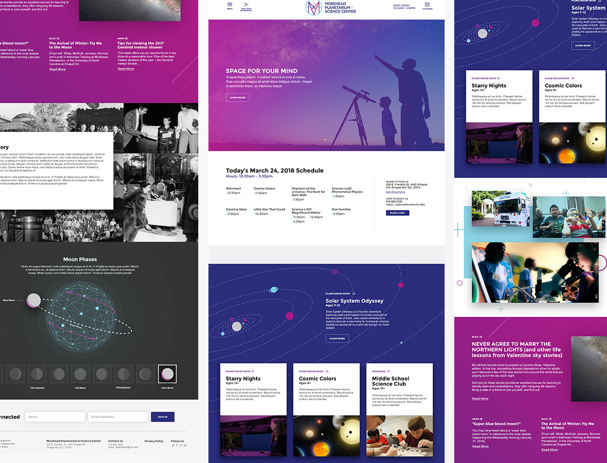
Whoa, what a fun project. This design was created to do a couple of things. One, give information about the place and two, make science fun. Interactive elements throughout the homepage allowed the user to become playful with the content. Providing the user with a better understanding of certain sections.
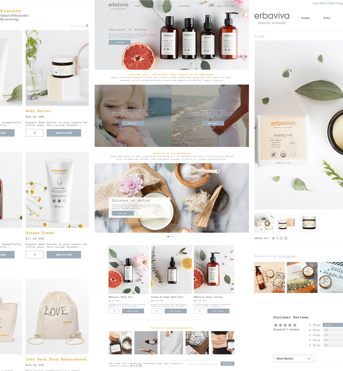
Organic Personal Skin Care for mommys and babies. I worked with the Erbaviva team to redesign their website. Our goal was to design a site that fit more with their brand using natural/organic and a more personable user interface. As always, the main concern with E-Commerce is converstion so keeping the user experience and direct users path to purchase.
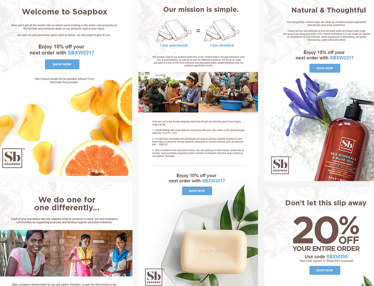

Soap=Hope, 1 bar purchased = 1 bar donated. I worked with soapbox to help with their design needs. Projects ranged from new email campaigns to redesigns for certain sections of their website. Goal was to expand upon their new brand and create meaningful and usable experiences for their growing online customer base.

I have worked with the digital team to lay the ground work for their new site redesign creating detailed wireframes, high fidelity designs for desktop, mobile and tablet. Once completed I worked with creating styles guides and design systems for their internal design team to take over.
- 1. Amazing Content
- 2. Load your own Content
- 3. Dynamic Content
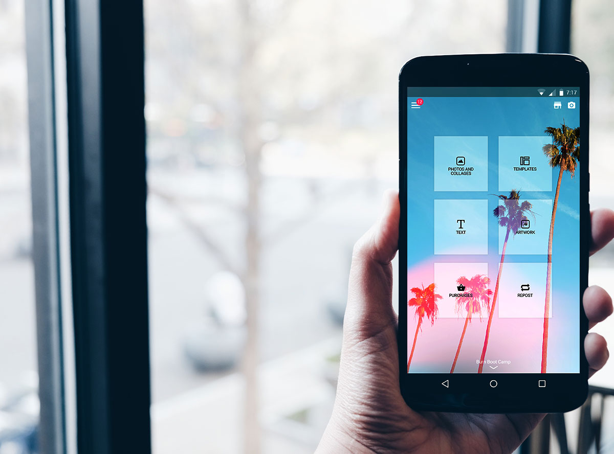
Today, Photofy is one of the most successful Marketing tools for consumers and enterprise clients. Garnering over 10+ Million downloads and working with some of the worlds top brands like Arbonne International, Tupperware, Life Time Fitness, and more.
Photofy is live on both Google Play, iTunes and Amazon.
- 10 Million+ Downloads
- 95 Thousand+ Reviews
- 4.8 Star Rating
- Millions in Revenue
- Top 3 Grossing app in Photography
- Multiple Google Play App Features
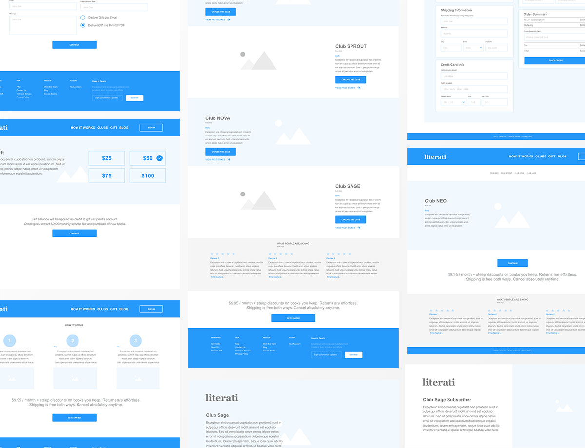
I worked with the CEO from Literai to reimagine their current website. Taking a deep dive into the UX I was able to define pain points and suggest easy ways to enhance the user experience and allow the website to convert more. I also took it a step further and provided future enhancement to help convert based on their evolving business model.
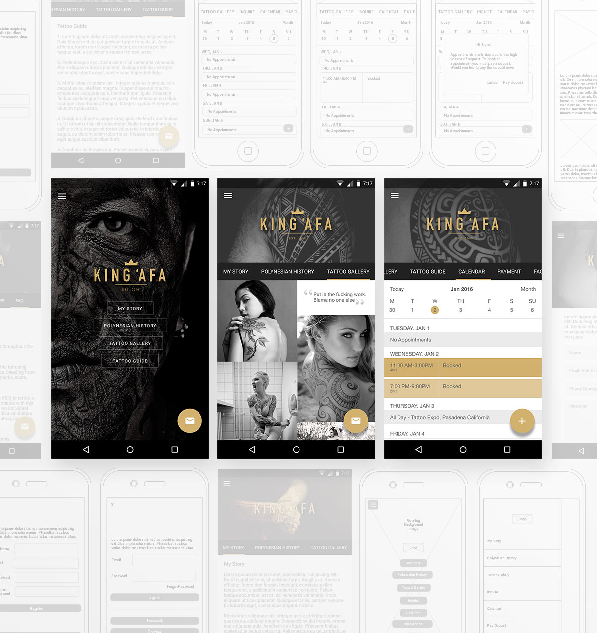

A tattoo artist has always had issues with controlling the vetting and scheduling process when acquiring new clients. Responding to inquiries, taking deposits, and scheduling appointments is a must but, usually take a back seat while they deal with their current client base. The goal with this app was to provide a solution for the artist that are really busy working on their craft and don't have time to manage all the business side of things.
Below are some of the key points used when building a complete solution for tattoo artists.
- 1. Easily curate new clients, take payment and schedule appointments using the app.
- 2. Send data to the server so it's accessible through mobile and desktop.
- 3. Provide easy access to the artist story, work, and contact information.
Find me on LinkedIn